---
title: Studio look and build plate
group: Guide
category: Guide
---
# Studio look and build plate
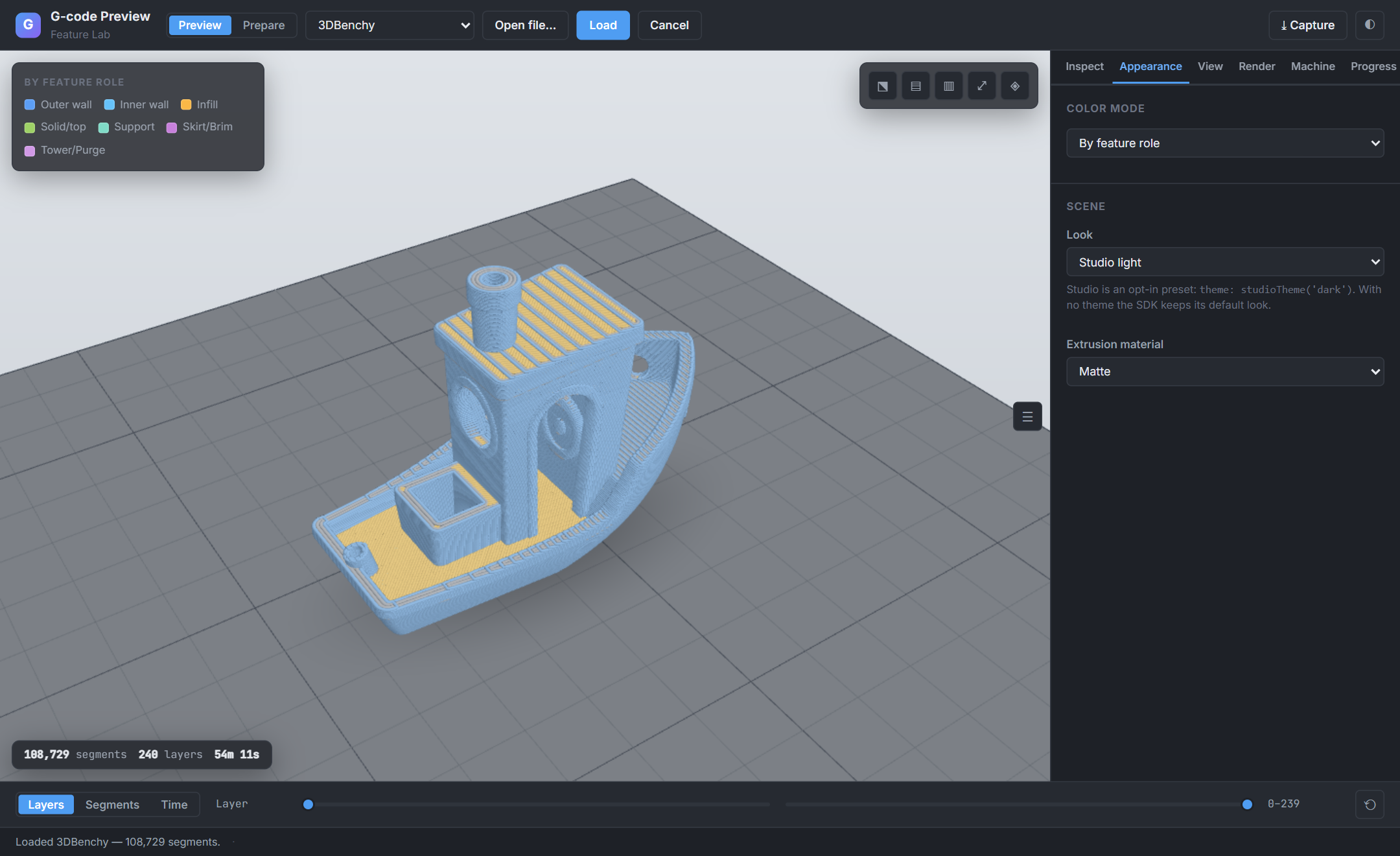
The SDK ships a **Studio look**: a gradient backdrop, a solid build plate with a labelled grid and outline, a soft
contact shadow, and a longer 32° lens. It is an **opt-in preset**. If you set no `theme`, the viewer renders exactly
as it always has (transparent background, 50° lens); the preset changes nothing until you ask for it.
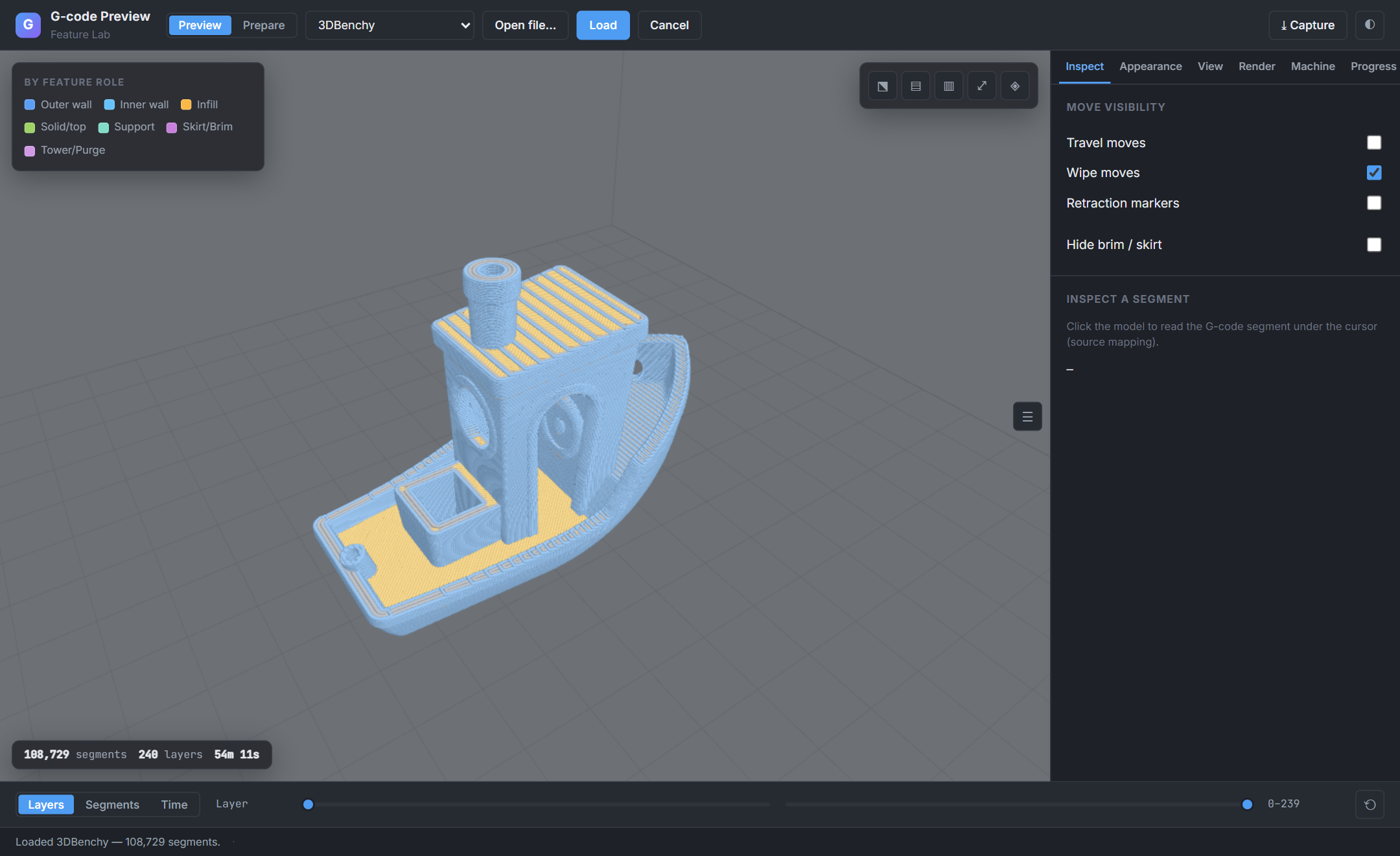
*The [Feature Lab](https://chestnutlabs.github.io/gcode-preview/demos/feature-lab/index.html) starts on Studio dark. It is a demo choice; pick "SDK default (no theme)" in Appearance to see the default look.*
## Opt in
```tsx
import { GcodePreview } from '@chestnutlabs/gcode-preview-react';
import { studioTheme, STUDIO_CAMERA_FOV } from '@chestnutlabs/gcode-renderer-three';
;
```
`studioTheme('dark' | 'light')` returns an ordinary `Theme`, and `STUDIO_CAMERA_FOV` is `32`. Both are exported by
`@chestnutlabs/gcode-renderer-three`, `@chestnutlabs/gcode-preview-core` and `@chestnutlabs/gcode-model-renderer`. The preset was measured with the
build-volume cage **off**, so turn it off with it (`showVolumeCage={false}`); the cage is a separate control, not a `Theme` field.
Both viewers take it: `` has the same `showVolumeCage` prop and `controls.setBuildVolumeCage(visible)`, and
turning the cage off keeps the plate, grid and contact shadow.
| Look | Backdrop | Plate and grid |
| --- | --- | --- |
| `studioTheme('dark')` | dark grey gradient | solid mid-grey plate, white 10 mm grid with stronger 50 mm lines and an outline |
| `studioTheme('light')` | pale grey gradient | the same plate, dark grid lines |
## Camera lens
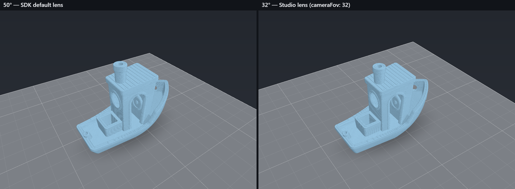
`cameraFov` (degrees, perspective only) takes `10`–`120`. The SDK default is `50`; `STUDIO_CAMERA_FOV` is `32`.
A value outside the range throws a `RangeError` rather than being clamped. Framing is lens-aware, so the model
stays in view at every lens, and changing the lens on a live viewer keeps the apparent size for lenses up to 50° (a wider lens pulls back
slightly so the model still fits). A lens set while the
camera is orthographic is remembered and applied when you return to perspective.
Imperatively: `controls.setCameraFov(deg)`. On the Web Component the lens is the `camera-fov` attribute: an invalid
value is ignored and the last valid lens is kept, while setting the `cameraFov` **property** to an invalid value
throws. The 2D renderer is a flat top-down view, so the `theme` and the cage are ignored, and a lens call records a
`renderer-unsupported` disclosure instead of changing anything (a deliberate difference between the renderers, not a gap).
## Sharpness on high-DPI screens
By default the viewer keeps the renderer's own pixel ratio, which can look soft on a high-DPI display. Set
`pixelRatio` to sharpen it: a number in (0, 4], or `'device'`, which follows `min(devicePixelRatio, 2)` and tracks a
monitor change or browser zoom live. Unset changes nothing.
```tsx
;
```
The drawing buffer has ratio² times the pixels (4× at ratio 2, 2.25× at 1.5; arithmetic, not a measured benchmark), so use `'device'` on a page with one viewer, and leave it unset
(or pick a number) when many viewers share a page or the GPU is weak. With `interactionQuality: 'auto'` the ratio
still drops while you orbit and settles back on yours. Imperatively: `controls.setPixelRatio(ratio)`; on the Web
Component it is the `pixel-ratio` attribute (an invalid value is ignored) and the `pixelRatio` property (an invalid
value throws). Anything else throws `RangeError` and is never clamped; the 2D renderer records a
`renderer-unsupported` disclosure.
An unsized `controls.capture()` is the resting drawing-buffer size when unset and the canvas's CSS size when set. With
the built-in renderer, setting a ratio never changes the default capture size; pass `width`/`height` for a crisper
image. `renderStill` and `renderModelStill` have no pixel-ratio option; size them with `width`/`height`.
## Build plate in the model viewer
The Prepare-side `` (the `/model` subpath of each adapter) takes the same `theme` and `cameraFov`, plus
a `buildVolume` that draws a plate under the part:
```tsx
import { ModelViewer } from '@chestnutlabs/gcode-preview-react/model';
;
```
The model viewer applies only the plate and backdrop part of a theme (`background`, the grid and outline fields,
`bedSurface`, `contactShadow`). Its lights are not themed, so a model is lit the same with or without a theme.
### Where the part sits: `placement`
A file's coordinates do not always say where a part sits on a plate, so the viewer reports how it decided, with
the project's usual honesty tiers. `ready` (`info.placement`, `info.placementOffset`) and the live state carry both:
| `placement` | When | What is drawn |
| --- | --- | --- |
| `known` | A Bambu/Orca slicer project made for your bed (its printable area matches `buildVolume` within 1 mm on every edge) whose parts lie on the bed (within 1 mm) | The parts where the file puts them |
| `inferred` | A Bambu/Orca project made for your bed whose parts are off the bed by whole workspace cells (a later plate of a multi-plate project) | The parts with that offset subtracted |
| `approximated` | Anything else: STL, CAD 3MF, PrusaSlicer 3MF, or a slicer project made for a different bed | The parts centred on the plate, dropped to z = 0 |
| `null` | No `buildVolume`, or the render scope spans more than one declared plate | No plate |
`placementOffset` is the `{ x, y, z }` shift in millimetres that was applied, so you can map file coordinates to
what is drawn. It is presentation only: the scene and `bounds` stay as authored. The viewer frames the **part**, not
the plate, so a small part on a large plate fills the view; dolly out to see the plate.
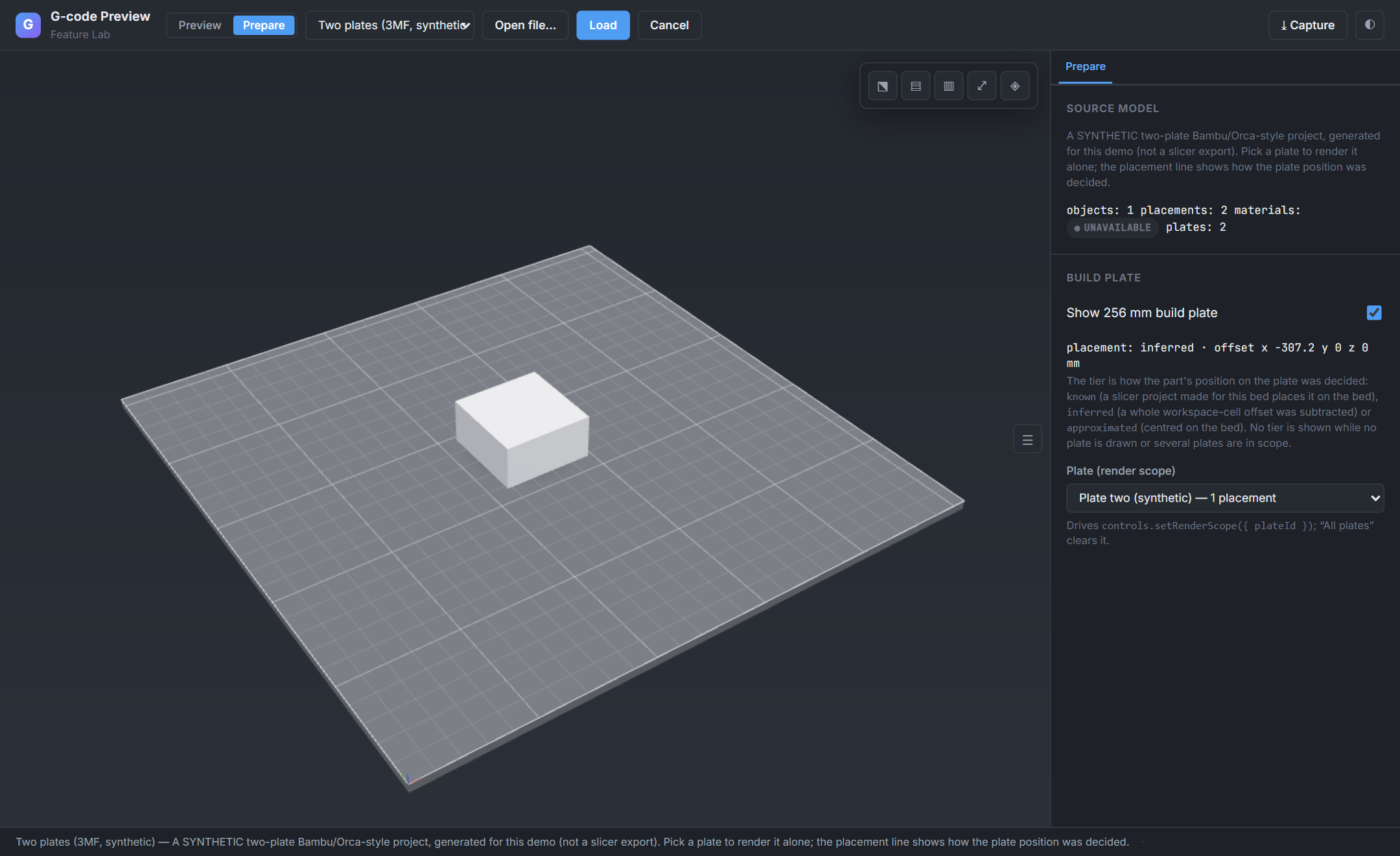
*Synthetic two-plate project generated for the demo (not a slicer export): plate 2 is selected with a render scope and reads `inferred` with an x offset of -307.2 mm.*
To show one plate of a multi-plate file, see the [plate selection recipe](recipes.md#show-one-plate-of-a-multi-plate-3mf).
### Transparent cutouts
`theme.background` beats the `background` prop, so after `setTheme` with a Studio theme the `background` prop has no
visible effect until the theme's background is cleared. For a transparent cutout, omit it:
```ts
const cutout = { ...studioTheme('dark'), background: null }; // plate and shadow, no backdrop
```
`controls.capture({ background })` beats everything, and `capture({ includeBuildVolume: false })` hides the plate and its
shadow for that capture.
## Try it
The Feature Lab has a **Look** selector, a **Lens** slider and a **Pixel ratio** selector on both Preview and Prepare, and a plate selector in
Prepare. The four framework showcases ([React](https://chestnutlabs.github.io/gcode-preview/demos/react/showcase.html),
[Vue](https://chestnutlabs.github.io/gcode-preview/demos/vue/showcase.html),
[Svelte](https://chestnutlabs.github.io/gcode-preview/demos/svelte/showcase.html),
[Web Component](https://chestnutlabs.github.io/gcode-preview/demos/webcomponent/showcase.html)) offer the same look and lens.